Back to Anne Golon Home / Perfume / Gallery
Bewitched by Angélique
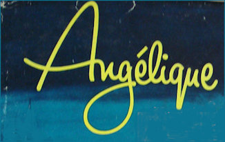
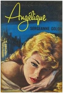
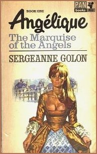
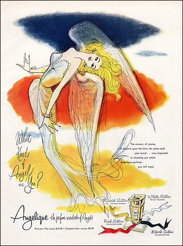
By isolating just the name of Angélique, I became curious about the choice of font used to entice us to know more about the emerald-eyed eponymous heroine over what would become a series of 14 weighty tomes. Her name was bewitching enough without the ad-man's added overt emphasis of her sexuality 'half angel, half devil, wholly woman' - the original picture of the Marquise of the Angels was demure enough, not so later editions by which time the books were already being classed (erroneously) as 'erotica.'
It has been quite difficult to source and identify the actual font, some experts I have asked are certain that it was hand-drawn and not an actual font. Others have pointed to similar but not quite the same fonts, either the capital A is different of certain strokes or have a look at the 'g' loop above in particular which is significantly different and yet to the untrained eye if could be mistaken as the same. I shall continue looking (the new Google Image search has thrown up much new information of all sorts which is useful) and hope that I may come across it by chance.
Font Search
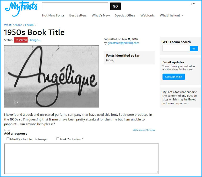
I found this website and tried to use its facility to identify the the font used on the first book of Angélique, Marquise of the Angels - it's a clever way of identifying specific fonts but also very difficult to refine down to specific loops and individual letters which sometimes run into each other. Whenever I thought I was getting close, there would be some subtle difference that did not make it a standard font. Certainly in the 1950s fonts were not as prolific as they are and I had hoped this one would fall into a printing press 'standard'. No such luck, the font may prove as unique as Angélique, herself. One professional graphic artist I spoke to actually thinks that it may have been a reproduction of a hand written rendering of the name.
I have created a Perfume page and part of the 'Gallery' is reproduced below where it is apparent that the logo is based on the original header title of the book, but the acute accent above the e (é) is absent.
Interestingly the 'Ad man's nightmare' (pictured below) a pronounced difference is evident in the painted advertising hoarding.
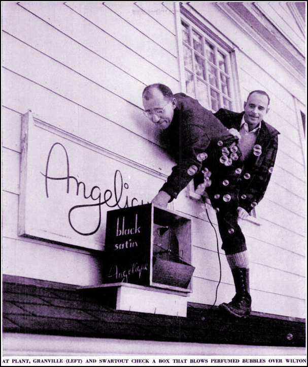
Sometime. someplace, somewhere circa 1950! Image © and courtesy of 'Life' Magazine 4th December 1950
The Perfume Gallery

Date page refreshed : 24th November 2020 (G)